Solar power
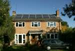 We've always tried to be efficient, to use resources and energy sparingly, and to generate minimum waste. In October 2010, we took the next logical step by putting our south facing roof to good use with PV (photo-voltaic) panels that generate solar electricity. The panels have a peak rated output of 3.3kW, but the actual output is generally less than that, and varies with time of day, time of year and the weather. Using published monthly averages for sunshine in this part of the country, I estimated that the panels would generate around 2.7MWh per year, which is about 10% more than our annual consumption. Of course that doesn't make us 'self sufficient', because we still need to import energy when we aren't generating, eg to power our lights at night, but we should export more than we import.
Installation was straight forward – we used Ardenham Energy . The panels are mounted on brackets that go under the tiles, and are fixed to the rafters. They feed DC power to an inverter mounted in the loft (see pictures below) which sends AC power down to the total generation meter in the cupboard with the normal meter (see pictures below). When the panels are generating, the light on the meter flashes at a rate proportional to the power. We wanted to be able to see the power without going to the cupboard and timing the flashes, so we use an Owl electricity monitor that sits on the kitchen worktop (see pictures below). It communicates with a sensor clipped round the power cable. We have another Owl meter to show the power that we are using (see below).
Results (up to end 2025)
Total generation
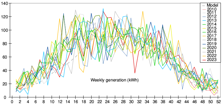 The first graph shows energy generated per week since installation in October 2010 . (For tidiness the graph starts with January as week 1, so the data for 2010 appear only at the right hand end). The dashed grey line shows the average output through a typical year that I expected (before installation). I derived it from published monthly averages for sunshine in Berkshire, normalised so that the total energy was the same as the figure derived from the manufacturer's data,
The graph shows a lot of fluctuation from week to week, which just reflects the variability of our weather. On a day when the panels could generate well over 2kW in the sun, they only generate a few hundred Watts if it is cloudy. The pattern varies from year to year, with some high peaks during periods of very sunny weather. The highest amount of energy generated in any week since installation was 132kWh in early June 2013.
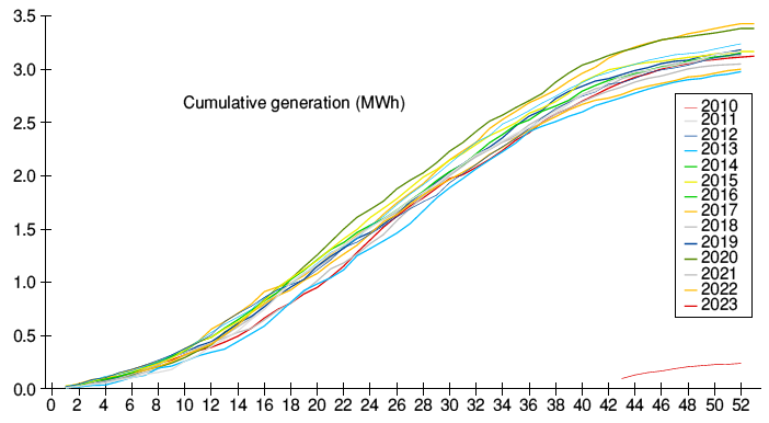 The second graph shows cumulative energy generation through each complete calender year. Like the first graph, it starts in January and it uses the same colours for each year. Data from the end of 2010 are do not form a complete year.
Energy generation has been at least 10% more than my predicted figure of 2.7MWh in every year except 2024 (when it was 7% over). But performance through the year has varied a lot. The early part of 2013 started significantly lower than other years, caught up during the July heat wave and ended the year only slightly lower than the other years, but still above my prediction. 2015 was unusual – cumulative generation by the autumn was higher than all other years but very dull weather in the rest of the year brought the total lower. 2017 was quite high early in the first half of the year but a dull summer meant it finished almost as low as 2013. 2020 (the year of Covid lockdowns) was ahead of all other years by late spring and went on to yield the highest total generation of any previous year. 2022 surpassed that by a narrow margin. 2024 was an odd year. Despite one week in the summer producing more than the equivalent week in other years, a grey summer led to the lowest annual total of any year. 2025 was also odd. By early autumn the total geneerated was more than any other year but the weather turned grey and by the end of the year it was slightly less than 2022.
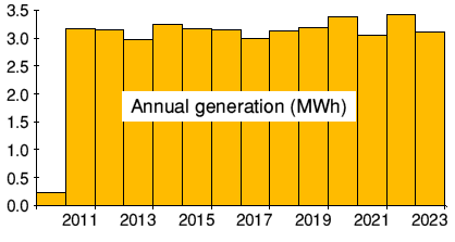 The cumulative figures for the thirteen complete years are: 3.17MWh, 3.14MWh, 3.00MWh, 3.24MWh, 3.17MWh, 3.15MWh, 3.00MWh, 3.13MWh, 3.18MWh, 3.40MWh, 3.05MWh, 3.43MWh, 3.12MWh, 2.9MWh), 3.38MWh.
The plot on the right shows a little variation year to year but not the steady decline that might be expected from panel deterioration with age. (The specification only guarantees 90% of initial output after 10 years and 80% after 25 years.). So far there is no evidence of declining panel performance.
Seasonal variation
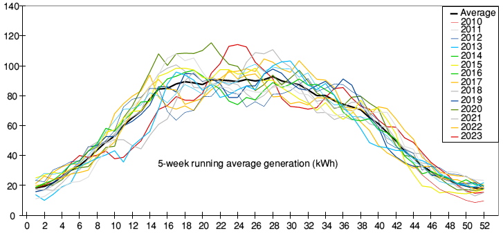 To see the underlying seasonal pattern, you have to remove the short term fluctuations due to the weather. I did that with rolling 5 week averages (ie the average of a period from 2 weeks before to 2 weeks after the week in question. That removes a lot of the variability, and averaging the values across more than one year removes much of the remaining variability to give the thick black line.
As you would expect, the output in winter is a lot lower than the rest of the year, but there is relatively little change in output from Spring through to early autumn, whereas you might expect a lot more to be generated in midsummer with longer days and the sun higher. There are two reasons this is not so. One is that however long the day, the sun can't shine directly on the panels for more than 12 hours, because during the other 12 hours, even if the sun is above the horizon and shining on the house, it is behind the panels. They still generate from the glow of the blue sky, but at much lower power – like when it is cloudy. The other reason is the angle of our roof, which is about 35° – too steep for maximum midsummer generation and better for the slightly lower spring and autumn sun. In fact 35° is ideal for maximising the overall output during the whole year (see: The Best Angle And Orientation For Solar Panels In The UK
Variation during the day
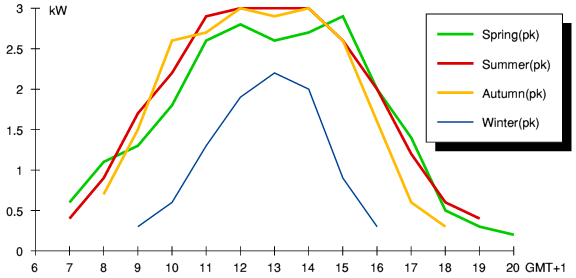 The power varies during the day (even with a clear sky), and the daily pattern varies round the year. Summer days are long and the sun rises high, but winter days are short with the sun low in the sky, while spring and autumn are in between. You might expect to see a similar pattern in what is generated, but while the curve in winter is indeed lower and narrower (fewer hours), there is relatively little difference between spring, summer and autumn. Although summer days are longer than in spring and autumn, the sun is behind the panels at both ends of the day, so the extra hours add very little generation. Even so, you might expect more to be generated during the middle of the day, with the sun higher in the sky, but it isn't because the roof angle is optimal for spring and autumn but not for summer (as explained above).
These graphs are based on readings in 2011 on sunny days in spring (end April), mid summer, autumn (mid September) and winter (mid December). To reduce the effect of fluctuation due to passing clouds I took readings at or near each hour over several days, and then used the highest figure for each hour. NB – All times are shown in BST, so midday is at 13.00 for all curves.
Import and export
Before we bought the panels, I predicted that we would export about 85% of what we generate. I had produced a model for generation at different times of day round the year using various published data, and a similar model for consumption based on knowing our approximate pattern of using various devices, and I had then compared the two models.
I can't measure exported energy directly, because I opted not to pay extra for a certified export meter. (We could have been paid a bit more than we do without a meter - where 50% is assumed - but the few pence per kWh extra did not justify the cost of the meter.)
I still wanted to see how my model matched reality, and I can work out how much energy we export by comparison of three separate things: the energy we generate (from the generation meter). the energy we import (from the normal meter) and the energy we consume. To measure consumption, I use an Owl electricity monitor that has a cumulative energy readout as well as the power display, linked to a current sensor fitted round the feed wire. That introduces a small error that needs correcting. Because the Owl measures current rather than measuring power directly it calculates the power by assuming a fixed voltage and power factor of 1. That is adequate for the Owl's intended educational use, but not quite accurate enough for my purposes. Quite a few of our devices, notably fluorescent lights and switched-mode power supplies in electronic equipment, have a power factor less than 1. As a result the display reads a bit higher than the true power consumption. I worked out an approximate correction factor by comparing consumption as measured by the Owl with that measured by the Consumer Unit during times when there was no generation, so the two should have been equal. My spreadsheet uses the correction factor to produce an approximation of actual power consumption, which is used in the plots..
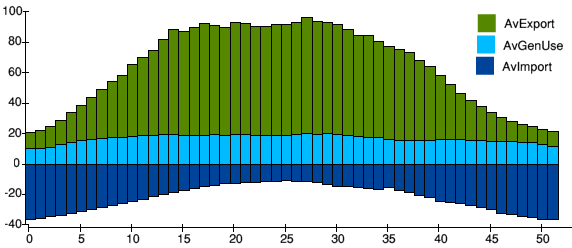 The graph shows the split throughout the year between energy generated and exported (green), energy generated and used on site (pale blue) and energy imported when we are using more than we generate (dark blue). So the area above the axis represents total energy generated (greatest in the summer) and the area below the axis represents the total energy imported (greatest in the winter) – all in kWh per week. The graph shows the average across all years since I started measuring consumption (April 2011, about 6 months after installation) to the end of 2019. Over that period we exported 78% of the energy generated, and we only needed to import 70% of the energy that we consumed. Since then, our consumption has reduced (eg from more energy efficient light bulbs) which increased the proportion of energy exported – 84% in 2025.
Ecotricity
We sell the power that we generate through Ecotricity's Microtricity scheme, which is backed by the Government Feed-In Tariff. We also buy our gas and electricity from Ecotricity because they invest all of their profit in building new green energy sources, while charging less than the dominant suppliers. When I last checked, Ecotricity was investing far more per customer in new green production facilities than the large suppliers, including those that offer 'green tariffs'. Ecotricity also provides a mobile phone service EcoTalk , whose profits are used to support wildlife projects.
Pigeons
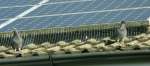
One thing we didn't consider when installing the panels is that the space underneath them is attractive for pigeons seeking a sheltered nesting site. About six years after installation we noticed increased pigeon activity that grew over the next few years until there was a significant colony. We think the pigeons might have been displaced from old buildings that were demolished in the town centre. When one of the cables was dislodged we decided to have protective guards fitted round the panels. While cleaning out the mess behind the panels, the contractors removed three nests. It took a while for the pigeons to take the hint and move elsewhere – some of them hung around (see picture below taken a few days after fitting).
Pictures
Click to enlarge and use arrows to move between them.
(Page updated
20-March-2026
)