Ergonomics at large
The good and the bad
There are lots of examples of good ergonomics all around us. You won't normally notice them, because well designed things tend not to be obtrusive. It's a bit like lighting or heating – you only notice it when something is wrong with it. You can spot good ergonomics with a little practice, by thinking 'why' things are as they are, and 'how' they fit with the people who use them, or the way they do things.
There are also many examples of poor ergonomics. You can spot them in the same way (by thinking about how they fail to fit with the people who use them, or the way they do things) but you can also discover them by falling foul of them.
Here are some good examples and some bad examples, with all the pictures repeated at the bottom so you can expand them to look more closely.
Good ergonomics
 Shaped to fit – You may have noticed how supermarket baskets tend to bang against the sides of your leg when they get full and heavy. With the traditional wire design, the bit where the handle is attached often digs in. You could hold the basket away from your body, but that would take a lot more effort than just letting your arm hang down. I spotted this basket in a Co-op in Shropshire. It looks odd at first, until you realise it has been designed to avoid colliding with your leg. The concave side naturally avoids banging your leg, without having to hold it so far away from you, and having the handle attached at the ends keeps that clear of your legs too. Someone took the trouble to think about that design.
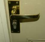
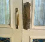 Push or pull – Most doors open only one way, so when you approach a closed door it's important to know whether to pull it or push it. You could have a sign telling you whether to push or pull (but you have to read it, which might be difficult in poor light, or if you don't speak the language). One very good way is to use a type of handle that makes it obvious. On the push side, you put a plate. You can't pull it because there is nothing to get hold of, and as well as keeping the paint clean, the plate tells you whether to push on the left or right side of the door, in case it isn't obvious. On the pull side you put a grab handle, which gives a strong hint that you should pull it.
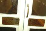 A less good example, elsewhere in the same hotel, gives a less slightly different message. This pair of doors also has one push and one pull. There is a handle on one door, but there isn't a plate at the same height (where you would naturally push) on the adjacent door. Both doors have large brass plates on them, but a bit too low for an adult to push. One says push and the other pull, but the black writing isn't very noticeable o then shiny brass that reflects the dark carpet, so you would almost certainly not spot it as you approach the door.
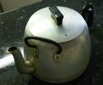 Two handed teapot – When you are catering for a lot of people, you need a big teapot. Such pots are quite a bit heavier than domestic teapots, and you often see them with an extra handle at the front to enable a two handed lift, and to help steady the spout when pouring. This pot has the extra handle at an angle, so the second hand can be held at a more natural angle, and doesn't need to reach right round over the spout. The person using this teapot couldn't understand why I was interested in it. To her it was just a teapot. When using something is so natural that you don't notice it, it is usually a good design. There is a drawback with this teapot though. It only works if you pour with your right hand, and use the left hand to steady the pot.
Poor ergonomics
 Arrows that don't point – Arrows are useful on signs for telling you where things are, especially if you drive into somewhere like a conference centre with drives leading in several directions.
You might think anyone designing signs for such a location would want the arrows to point clearly, since drivers can't study the signs in detail, and need to make quick decisions about which way to turn. But not so. The arrows shown here are stylish, but not very helpful when it comes to pointing the way. Viewed close up, the direction is clear, even though the symbols look a little odd being split into positive and negative halves.
 But from the distance a typical driver will see them, the shape of the arrow gets lost, and the dominant directional effect is the difference between the light and dark halves of the circles containing the arrows, with the white semi circles seeming to point at right angles to the intended direction of the arrows. The words on the sign are perfectly legible, but the sign is useless if you can't decipher the directions.
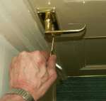
 Find the key slot – This is in another hotel. As you stand in front of the door, the lock is almost completely hidden below the door handle.
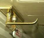 The lock is visible if you move to the side, but even when you have discovered it, it is still hard to see the slot so you know which way up the key needs to go in.
 If you had eyes at waist height, the lock would be much easier to see.
 Confusing words – This road sign is clearly legible, but what does it mean. It appears to say that the road ahead is closed (but it isn't) and the arrow seems to direct you to turn left (but you can't because the road is closed).
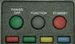 Misleading controls – I once wanted to switch on the TV in a hotel room. I tried the power/off button on the handset. Then I tried to select a channel, which sometimes gets a set out of standby. But nothing happened.
 The button on the handset labelled ‘Power / Off’ is a bit ambiguous. Does it mean it only switches the power off, in which case green seems an odd colour to use (unless the designer though that being off was safer).
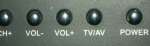
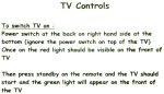 While wondering what else to try I noticed there were instructions for operating the TV on the desk. Obviously I wasn’t the first person to have a problem. They told me to ignore the button on the top of the TV (so why is it there?) and to use the power switch on the right hand side at the bottom'.
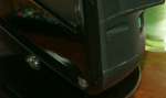 I followed the instructions and found a switch at the bottom at the back. Strictly it was on the side, but since it was in a recess it was pretty well hidden and almost round the back.
Who on earth decided that was a sensible place to put it?
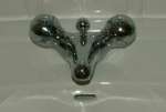 Taps – A tap should be a simple, easy to use thing. Many are, but tap designers often make things harder than they need be.
Colour – Using red and blue to show hot and cold avoids any language problems, but if the design is so subtly that you can't see it, how do you know which is which. These taps have a coloured line round each knob, but the lines are so thin they are hard to see, especially if you wear glasses and take them off when you wash your face.
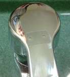
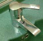 Levers on mixer taps – Taps with one lever to operate hot and cold together are becoming more popular. Typically you lift the lever to control the flow rate and move it from side to side to control the temperature. But which way is which? Often the level has a red and a blue dot on it, but if you want cold do you turn the lever in the direction of the blue dot or do you turn it so the blue dot faces you? You probably end up finding out by trial and error. The tap here has two dots, but they aren't coloured, so which way do you turn it?
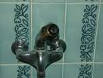 Complicated movements – Separating the controls for temperature and flow is a good idea, because you often need quite a delicate adjustment for temperature, and don't want it to be upset if you turn the flow up or down a bit. But there are good and bad ways to 'separate' the controls. The shower control shown here is a bad way. Temperature is controlled by swivelling the whole assembly from side to side, and flow is controlled by turning the know on the end. So in order to change the flow you have to get hold of the temperature control, and probably move it as you twist the flow knob.
Other examples
There are some graphic descriptions of some much more serious ergonomic failures here: Six Disasters Caused by Poorly Designed User Interfaces
Pictures
Click on an image to see an enlarged version.