Car park ergonomics
Wherever people interact with their environment, and especially with equipment in it, there is scope for human error if there is a mismatch with the way people think, and the nature of the tasks they are trying to do. That doesn't just apply to things like power station control rooms, aircraft cockpits or high-tech gadgets, you can find ergonomic problems in some very ordinary places – like a car park.
What could go wrong in a car park?
You may well ask! A car park ought to be simple to get right, but in a car park near where I live things went badly wrong, with many people facing penalty charges for buying the wrong tickets. This is not just the occasional absent minded person – it had been happening week in week out for years, some times as often as once a day. Many people grit their teeth and pay up, and some are excused the penalty, but a few complain to the press, and those are the ones that everyone hears about. This has been a regular feature in the local paper over the years. The victims protest their innocence and complain about the stupidity of the system. The car park operators claim there is nothing wrong, and that their signs are perfectly clear. And the problem remains.
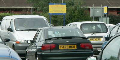
 The car park is used by hundreds of people a day, and most of them get it right. Many know about the two types of ticket, and of those who don't, many use the right machine anyway. But that doesn't alter the fact that people keep falling into the trap. When the same mistake is repeated over and over by different people, and when the problem persists for years, it should be obvious that something is wrong. If lots of different pilots kept landing on the wrong runway at an airport, someone would look at the design of the airfield, and improve it to eliminate the mistakes. That's how flying gets safer. But no one tried to understand the problems in the car park. They just kept saying that 'the signs are quite clear [to me], so people shouldn't make mistakes'. Occasionally they added even more signs, with even more words – far too many words for anyone in a hurry ever to read.
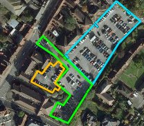
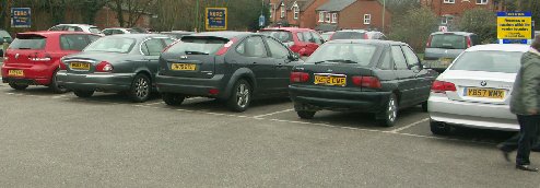
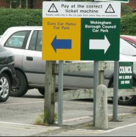
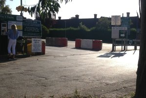
What I haven't said up to this point is that the car park is in two parts, owned and operated by different organisations. They are marked blue and green in the picture (the orange area is private). Years ago both parts were operated as one, but the owners subsequently went their separate ways, which is when the problems began. To add to the confusion you have to go through one part to get to the other, as you can see from the picture.
Looking at the problem
I live nearby, and after yet another article in the paper, I decided to investigate. I walked round the car park looking at the signs, the ticket machines and the layout. Some signs had lots of words, some of which were about the need to buy the correct sort of ticket. The two operators also used different visual branding – one mainly green and white and the other mainly yellow and blue. I would have had no difficulty buying the right ticket. But then I already knew there are different tickets for the two areas, unlike the people who keep falling into the trap. So I tried to look more closely to find the underlying causes of the errors.
Ergonomics teaches you to think about the context in which people operate, not just about the immediate task but about all the other tasks that influence it, about their likely goals and pressures. I tried to think where people would be, what they would see and what they would do during the critical time between entering the car park and buying a ticket, I tried to understand how someone could buy the wrong ticket. I tried to see the car park through the eyes of people who didn't already know what I know about the problem. I also took pictures of lots of things, when the car park was full and busy and when it was less busy. I soon realised that many of the signs could be either missed or misinterpreted. I realised that buying a ticket was just a small part of the wider picture of why people were in the car park and where they were going next. After all, parking a car is just part of the process of getting to where you want to be – it isn't an end in itself.
Some of the issues
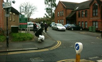 At the entrance (which is actually part of the Council car park) there is no indication that there are two separate car parks. You drive in past many green and white Council signs and a Council payment machine.
 Even the entrance to the Euro Car Parks (ECP) area is flanked by Council signs. If you have time to read them (which you probably don't while avoiding cars and pedestrians) they tell you that the area beyond the fence is privately operated (but they don't say by whom). What does that mean to the car park user? The signs say that you should buy a ticket from the correct machine (but they don't say what 'correct' means).
Sm.jpg) Inside the ECP area, the signs are yellow and blue, but many are small, in the distance, and hidden behind cars. Some 30 metres in from the entrance is a large yellow and blue sign and a payment machine, but you might not go that far, and having passed a machine on the way in, you may naturally go back to it to pay (unless you happen to spot a nearer one).
Inside the ECP area, the signs are yellow and blue, but many are small, in the distance, and hidden behind cars. Some 30 metres in from the entrance is a large yellow and blue sign and a payment machine, but you might not go that far, and having passed a machine on the way in, you may naturally go back to it to pay (unless you happen to spot a nearer one).
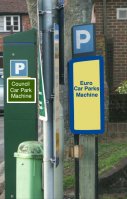
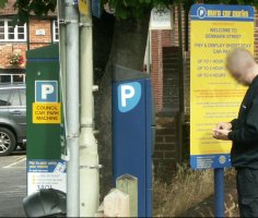
RSm.jpg) The machine you pass on the way in is a Council machine. It stands back-to-back with an ECP machine, but if you walk to it on the same side of the access road that you parked, you might not see the second machine, especially since it is often part hidden by parked vehicles. Even if you do spot it, viewed end-on it isn't that clear that the two machines are of different types, so you might just use the one that isn't busy.
The machine you pass on the way in is a Council machine. It stands back-to-back with an ECP machine, but if you walk to it on the same side of the access road that you parked, you might not see the second machine, especially since it is often part hidden by parked vehicles. Even if you do spot it, viewed end-on it isn't that clear that the two machines are of different types, so you might just use the one that isn't busy.
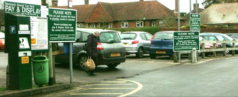
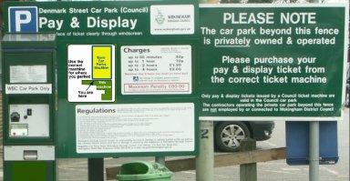
Sm.jpg) If you do find yourself about to buy a ticket at the Council machine, you are confronted with a vast amount of information spread across signs over six feet wide. There are some words about buying from the correct machine, and about tickets not being valid for the other site, but if you don't understand who operates which part of the car park, or you don't know which part you are in, that may not mean a lot to you.
If you do find yourself about to buy a ticket at the Council machine, you are confronted with a vast amount of information spread across signs over six feet wide. There are some words about buying from the correct machine, and about tickets not being valid for the other site, but if you don't understand who operates which part of the car park, or you don't know which part you are in, that may not mean a lot to you.
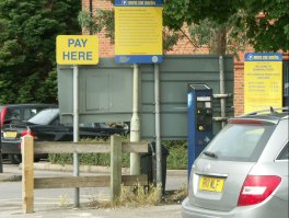
In any case, people come to the machine to buy a ticket. All they want to know is how much to pay and where to put the money. The charges are helpfully displayed right next to the machine, so that is where they will focus, not on all the rest.
This is just a brief overview of some of the issues in my full report , which includes more detail and analysis.
Potential solutions
The best solution would be to operate the car park as a single unit (which it used to be) but even with it split, more could be done to make it work better. Three things are necessary to reduce the risk of tickets being bought from the wrong machine:
- Motorists must understand that the car park is split into two separately operated areas.
- They must know which area they have parked in.
- They must be clear where to obtain the correct type of ticket.
Several improvements, some quite modest, would help to ensure those three things. Here is a summary of some of the key points. My report explains them more fully.
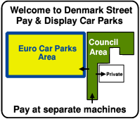 Shared access road – When you drive in, you assume it is 'a car park' not 'two car parks'. That message should be visible at the entrance, before people become engrossed in doing anything else, like finding a parking space. Adding one clear, simple, pictorial sign could get that message over in the critical few seconds available, even alongside the mass of small print that is there already. The sign should use the operators' brand colours to show which area is where, as shown in this mock-up.
M+Sm.jpg) Entrance to the ECP area – The entrance is currently flanked with Council signs. It would be much clearer to use signs in the different branding colours to show that you are entering a different area, as shown in this mock-up.
Entrance to the ECP area – The entrance is currently flanked with Council signs. It would be much clearer to use signs in the different branding colours to show that you are entering a different area, as shown in this mock-up.
 Signs within the ECP area – When the car park is full, many of the signs on the boundary fence are hidden by parked cars. Putting them higher on posts would make them visible above the cars. This mock up shows some alternative signs based on ECP colours.
MSm.jpg)
Sm.jpg) Sign by ECP payment machine – The ECP payment machine that backs onto the Council machine is regularly hidden by parked cars. There is a sign near it, but that too is often obscured, as shown in the first image. Raising the sign, with an arrow pointing directly at the machine (rather than the bent 'round the corner' arrow currently used) would make it visible to more people, as shown in the mock up in the second image.
Sign by ECP payment machine – The ECP payment machine that backs onto the Council machine is regularly hidden by parked cars. There is a sign near it, but that too is often obscured, as shown in the first image. Raising the sign, with an arrow pointing directly at the machine (rather than the bent 'round the corner' arrow currently used) would make it visible to more people, as shown in the mock up in the second image.
RMSm.jpg) Exit from ECP area – It is easy to walk out of the ECP area on the way to a ticket machine without spotting an ECP sign. There isn't one on the left (the side where people park) and the only sign on the right is not next to the walkway, and often obscured by vehicles parked in spaces reserved for businesses. Having prominent signs with a clear message next to where people walk would be much more effective, as shown in this mock-up.
Exit from ECP area – It is easy to walk out of the ECP area on the way to a ticket machine without spotting an ECP sign. There isn't one on the left (the side where people park) and the only sign on the right is not next to the walkway, and often obscured by vehicles parked in spaces reserved for businesses. Having prominent signs with a clear message next to where people walk would be much more effective, as shown in this mock-up.
Sm2.jpg) The back to back machines – The Council machine by the main entrance and the ECP machine near the exit from the ECP area stand back-to-back, and the 'fence' between them is almost non-existent. The visual branding is poor, especially when viewed end on (see first image) and it is easy to assume they are just alternatives, especially if one of them is in use and you are in a hurry. Clearer visual branding of the two machines, as shown by the mock up in the second image, would make it clear that they are not equivalent.
The back to back machines – The Council machine by the main entrance and the ECP machine near the exit from the ECP area stand back-to-back, and the 'fence' between them is almost non-existent. The visual branding is poor, especially when viewed end on (see first image) and it is easy to assume they are just alternatives, especially if one of them is in use and you are in a hurry. Clearer visual branding of the two machines, as shown by the mock up in the second image, would make it clear that they are not equivalent.
Moving one or other machine could also help to separate them in the minds of car park users. The best move would be to transfer the ECP machine to the east side of the main driveway, ie on the side where public users park. Alternatively, the Council machine could be moved away from the ECP entrance, but moving it either way has drawbacks. Moving west would make it farther from most Council car park spaces, and moving it east may make it harder for anyone parked in the spaces next to the entrance from Denmark Street to find it.
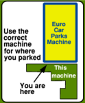 Information overload – Over the years the operators have added more and more signs, with more and more words, in the hope that throwing information at people will solve the problem. But the more words there are, the less likely people are to read them. When you want to buy a ticket, all you need is a machine and something to tell you how much money to put in it. The rest is just distraction. The critical Council machine is surrounded by information, but it is useless if people don't read it. The most important information at this point (apart from charges) is to make sure that anyone parked in the ECP area realises that this is the wrong machine. A visual diagram relating the machine to the parking areas (oriented to where the person is standing) would do that more reliably than lots of words ( as shown in the first image). It needs to be somewhere that a person buying a ticket will look, ie between the machine and the list of charges (as shown by the mock-up in the second image). The large sign on the right has been left in the mock-up, but would be redundant with the new sign.
Progress
 For my work to do any good, it had to change things, so I needed to talk to the operators. The Council was very interested, and offered to talk to the other operator about possible joint actions. After six months it was clear that the two operators weren't likely to work together, so I recommended that the Council should do things that would work unilaterally. In summer 2012, the Council implemented one of my recommendations, (see right). This sign faces motorists as they turn into the ECP area. It is much clearer than what was there before, and ECP car park attendants tell me that it has greatly reduced the number of people buying the wrong ticket.
 That's a big improvement, but one sign alone won't completely solve the problem. For example, at busy times, while concentrating on avoiding pedestrians and cars, a driver might not notice it. In any case, it can be obscured by cars emerging (see right).
 Hot on the Council's heels, ECP also installed a lot of new signs. Most of them are full of words that people won't read, but at least they are visible above the cars, which the earlier ones weren't, and they help to brand the area, especially along the boundary with the Council area.
 The branding and signage by the critical payment machine has also improved, and the fence has been rebuilt to show the boundary more clearly, as shown here (left image). The ECP meter still isn't labelled, but at least it is blue rather than grey, making it visually different from the Council machine (right image).
Postscript
When the Council implemented only one of my recommendations I expected it to make a big improvement, but I didn't expect it to solve the problem completely. Talking to one of the attendants suggested that fewer of the cautions and penalties give were for buying the wrong type of ticket, but in August 2013 two angry letters appeared in the press from people who had been caught out by the car park, so it was clear that further action is needed.
The subsequent changes made on the ECP side may also have helped, and the car park managed to stay out of the press for the next few years. However, the problem hasn't gone away, as I discovered when talking to an attendant in 2017. As expected, most of the problems occur near the boundary between the two carparks, and many involve people who have not used the car park before.
Was it worth it?
I put a lot of time into this study. It was an interesting problem and I had the skills to do it, but mainly I felt it was wrong for unsuspecting members of the public to be harassed for making innocent mistakes when no one was looking at the obvious cause – bad design.
If I had been hired to do the work professionally, I would have put in place proper 'before and after' monitoring to measure both the scale of the original problem, and the degree of improvement from making changes. But all I had to work with was anecdotal – press reports and conversations with car park attendants and council officials – together with my own observations. What had been 'a big problem' seemed to have been turned into 'a lesser problem', but beyond that I had no means to quantify the improvement. I expected that some people would continue to get caught out, albeit much less often, and that seems to be so (see above)
It would have been better to implement more of my recommendations, to catch errors at different stages of the user's progression from entering the car park to buying a ticket. That principle of adding layers of protection is known in the safety industry as 'Defence in Depth', because an error that slips past one protective layer, gets caught by the next layer. Each layer of protection added will give diminishing returns, but it's still worth doing to prevent accidents that kill people. In the case of the carpark no one gets killed, and I can understand the operators not wanting to spend more money once the problem was out of the headlines, but it was frustrating to see the job only half done when it could so easily have been done better.
The changes are a big improvement on how things had been for ten years, with less heartache for unsuspecting users (and less work for the car park attendants) but there is clearly more that could be done.
The full report
This page only gives a very brief overview of the work I did and subsequent changes made. For more details, with analysis, pictures and recommendations, you can download the original full report (3.5MB PDF) .
 Then the unexpected happened ...
In 2019 the owners of the area managed by ECP submitted a planning application to build 77 homes on it. That was rejected – hardly surprising since the car park is a heavily used resource in a busy part of the town. Then at the end of August, with just a few days notice, the carpark was closed, with concrete blocks preventing access. That made it impossible to buy a ticket from the wrong machine, but wasn't the solution that anyone wanted.
And finally ...
In 2020 the Council acquired the disputed part of the car park and re-opened it as an integral part of the Council's own car park.
Copyright © 2011–2020 John Harrison